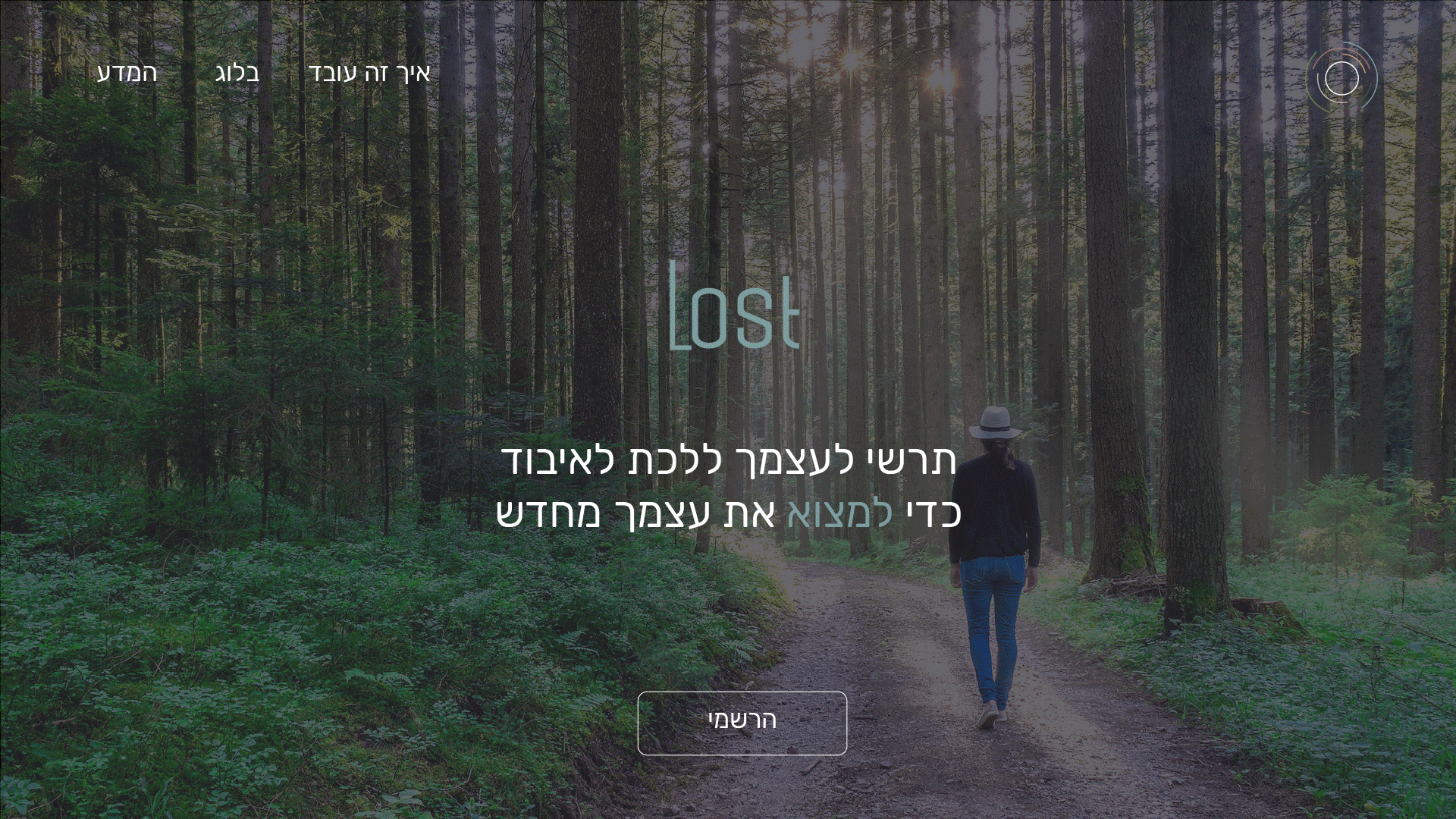
Lost
Lost is an app offering users in Israel a place to find “Forest Bathing” trails and helps them gain, and maintain, the health benefits derived from the “Forest Bathing” activity.
Client
Category
Year
Academic Project
UX / UI Design
2018
In Short
The Brief
We were asked to create an app either in the travel field, the dating field or an online store. We were also asked to create a mini-site
The Problem
“Forest Bathing” is an ancient Japanese practice, that has become popular in the West only in the last few years. However, this practice is relatively unknown in Israel.
The Solution
Creating a unique trailing app in such a way that will separate it from other travel apps. This distinction will focus on creating a well balanced visual branding as well as singular features that will allure the target users to use and re-use the app.
My Roll
User research, user interviews, persona creation, user journey, user testing, wire frames and mock-ups.
Discovery
Research
Shinrin – Yoku in Japanese means taking in the forest through your senses. Connecting with sight, sound, smell, taste and touch.
The Japanese practice of “Forest Bathing” is scientifically proven to improve your health. To lower heart rate and blood pressure, reduce stress hormone production, boost the immune system and improve the overall feeling of well being.
A 2009 study shows significant increase in NK cell activity (associated with immune system health and cancer prevention) in the week after a forest visit, and positive effects lasted a month following each visit.
Persona
The target user was defined as women at the age of 20-40, with previous knowledge of the therapy and spiritual world, Yoga, Pilates or meditation. With that in mind, a persona was created – Sivan Lahav.

Sivan, 31
Sivan is an attorney living in Pardes – Chana. She is married with no children, has high technological abilities and likes fantasy books, yoga and meditation. She is curious, stubborn and optimistic.
Goals
To achieve a sense of balance between work and the private life.
To reach inner peace.
To start thinking of extending the family cell.
Challenges
To not achieve a sense of balance between work and the private life.
To feel unfulfilled at work and in the private life.
To not let kids prevent any career growth.
Sivan wakes up at around 06:00 and starts the day with a yoga practice followed by a brief meditation. She prepares a cup of coffee and drinks it on the car on her way to work. In the office, she spends a few minutes on Facebook and Whatsapp and then starts to work. Part of the time she works in her office and the rest, in meetings with clients or colleagues. She leaves the office at around 19:00 and meets her husband at their apartment. They eat dinner together and work for an additional hour and a half.
Prototypes
Site Map
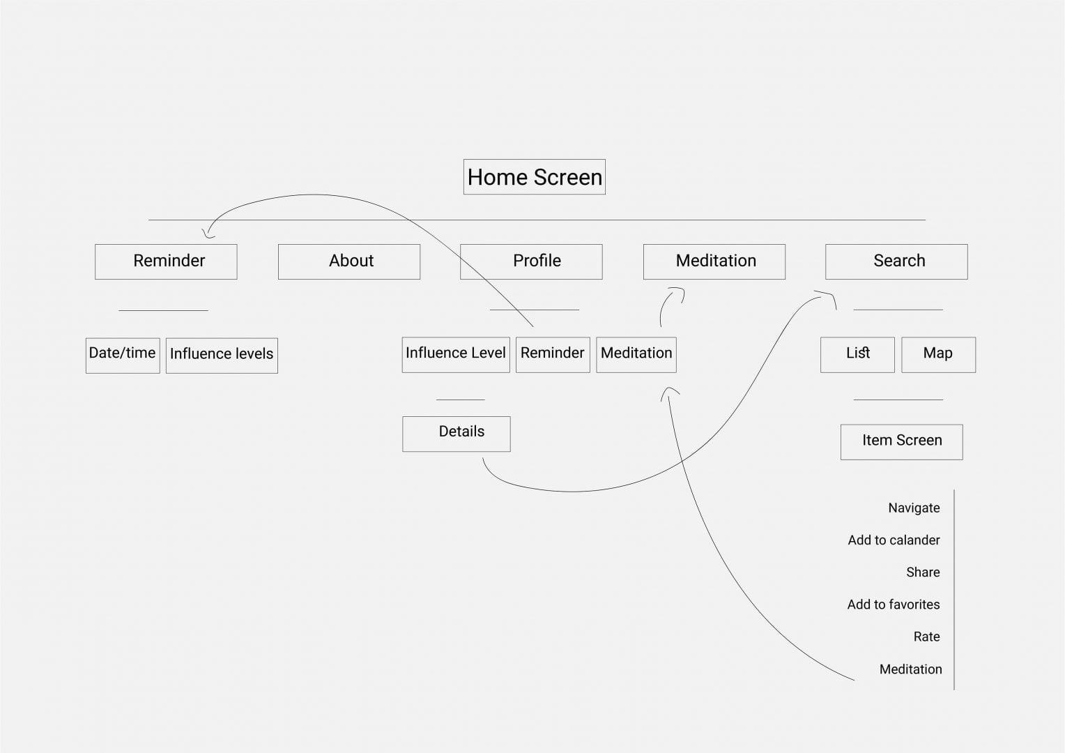
User Journey
At Home – picking a trail based on distance and duration and navigation to the location.
On Trail – Following the trail as shown on the app, taking pictures of the place and choosing a meditation session from the app based on theme and length.
At Home – Uploading the photos she took earlier, sharing the photos on Facebook or whats-app, rating the trail, saving it in favorites and setting reminders as date/time or influence level alerts.
Wire Frames
User Testing
Using the high fidelity wire frames, we created a clickable prototype to test the structure of the app and to gain user feedback, based on users navigation within the app, according to a set of tasks written out to be followed by them.
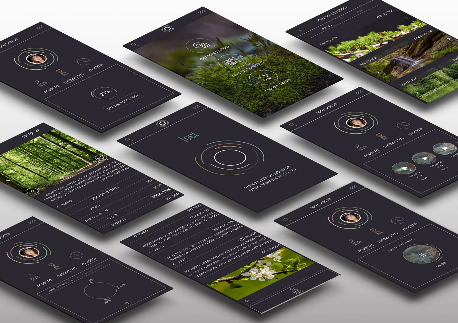
Design
Concept
Having the persona and the target users in mind, we decided to help our users fulfill their desire for balance, serenity and peace after their busy and hectic work life, by creating a sense of minimalism and de-clutter, resulting from a defined and clean visual appearance but more importantly, from a decision minimalism.
When a user will enter the app, she will be visually surrounded by a feeling of serenity and calm. But she will also feel peaceful due to the minimum amount of choices she will have to make.
We also decided to have a dark background for the app screens, as a way of setting aside the app, since we have noticed that the majority of all travel or meditation apps have bright screens. It also goes together with the brand identity of search and a feeling of getting lost.
Color Scheme and Fonts
Icons
Mock-Ups
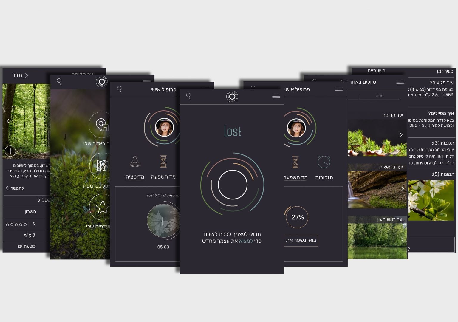
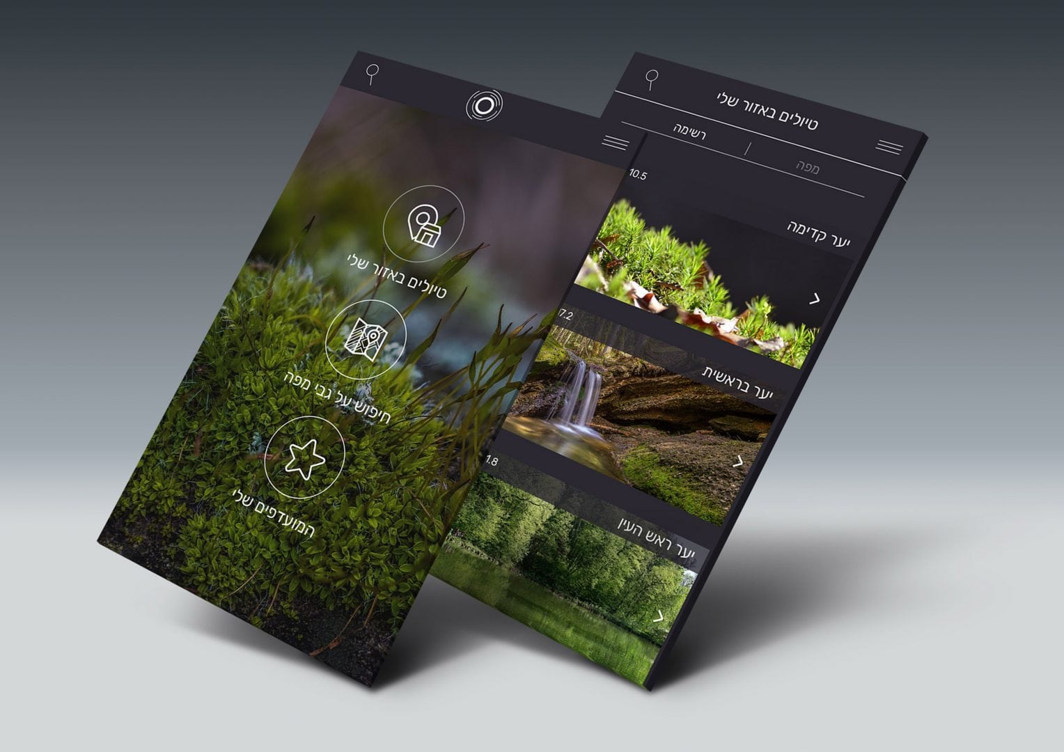
In light of the de-clutter concept, the user will only need to decide weather to view the trail options on map or on a list and to decide on the specific trail based on distance and duration. Minimal decision at it’s best.
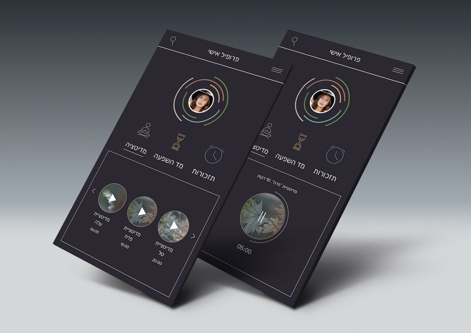
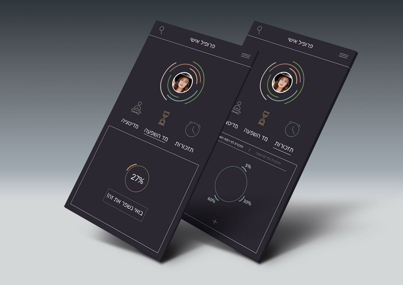
A main feature in the app is the meditation option. The user can excess the meditation either from the trail page or the meditation page and can add certain meditations as favorites.
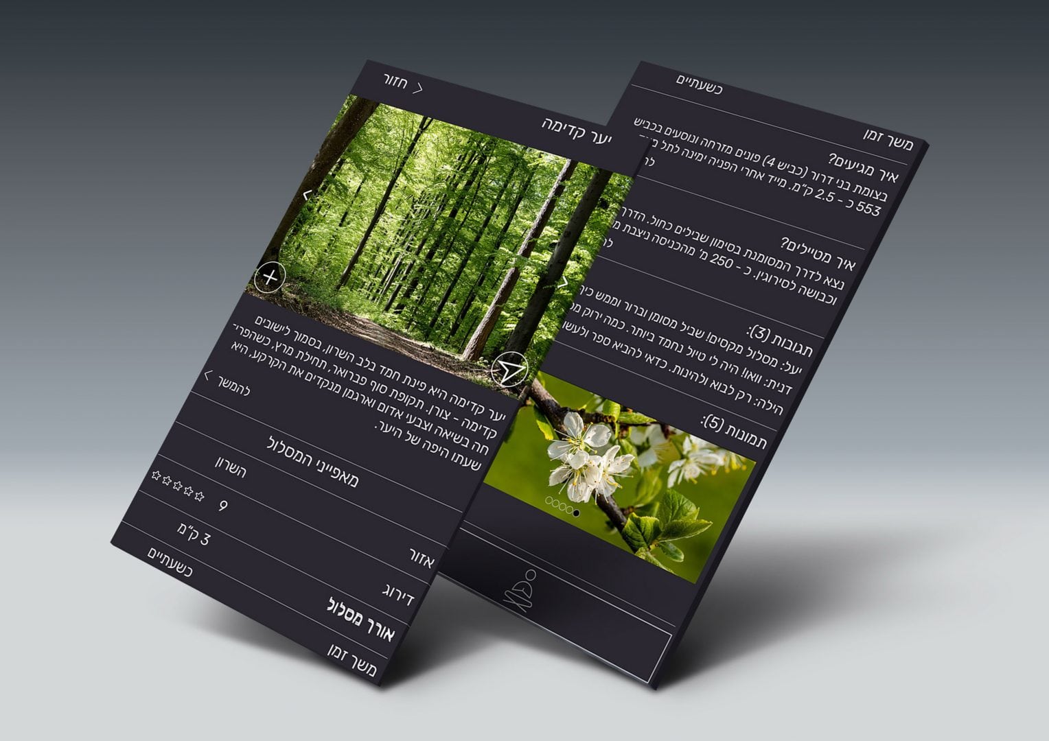
As with any standard travel app, Lost has all the “regular” features, such as description of the trail, location, directions, photos of the area, option to leave comments, to rate the trail and to upload photos.
The ultimate goal of the app is to assist the user to gain and maintain high levels of health influence subject to the user’s trail practice. As a result, a key feature is the reminder option. The user can choose to set an alarm according to specific date and time or use their own levels of health influence as the alarm trigger
Mini Site