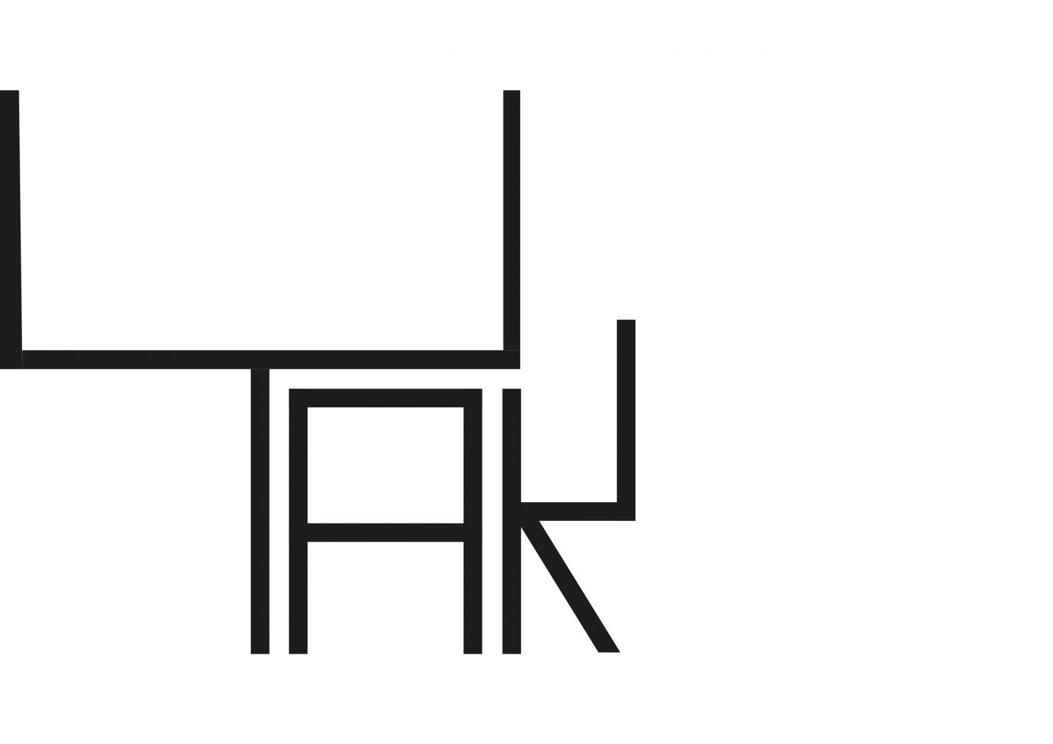
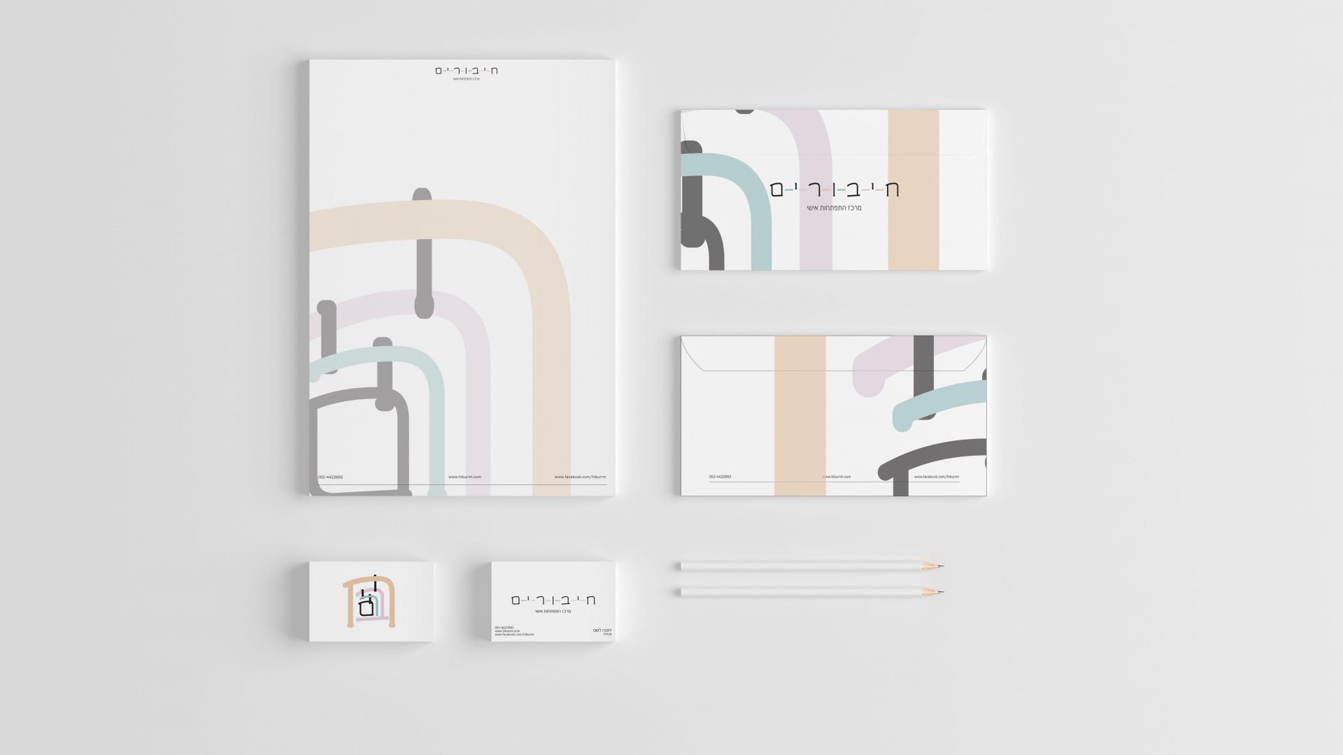
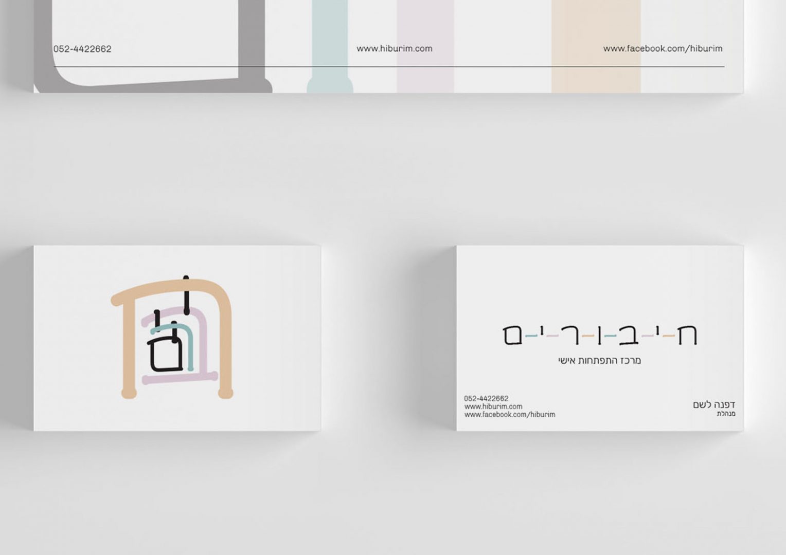
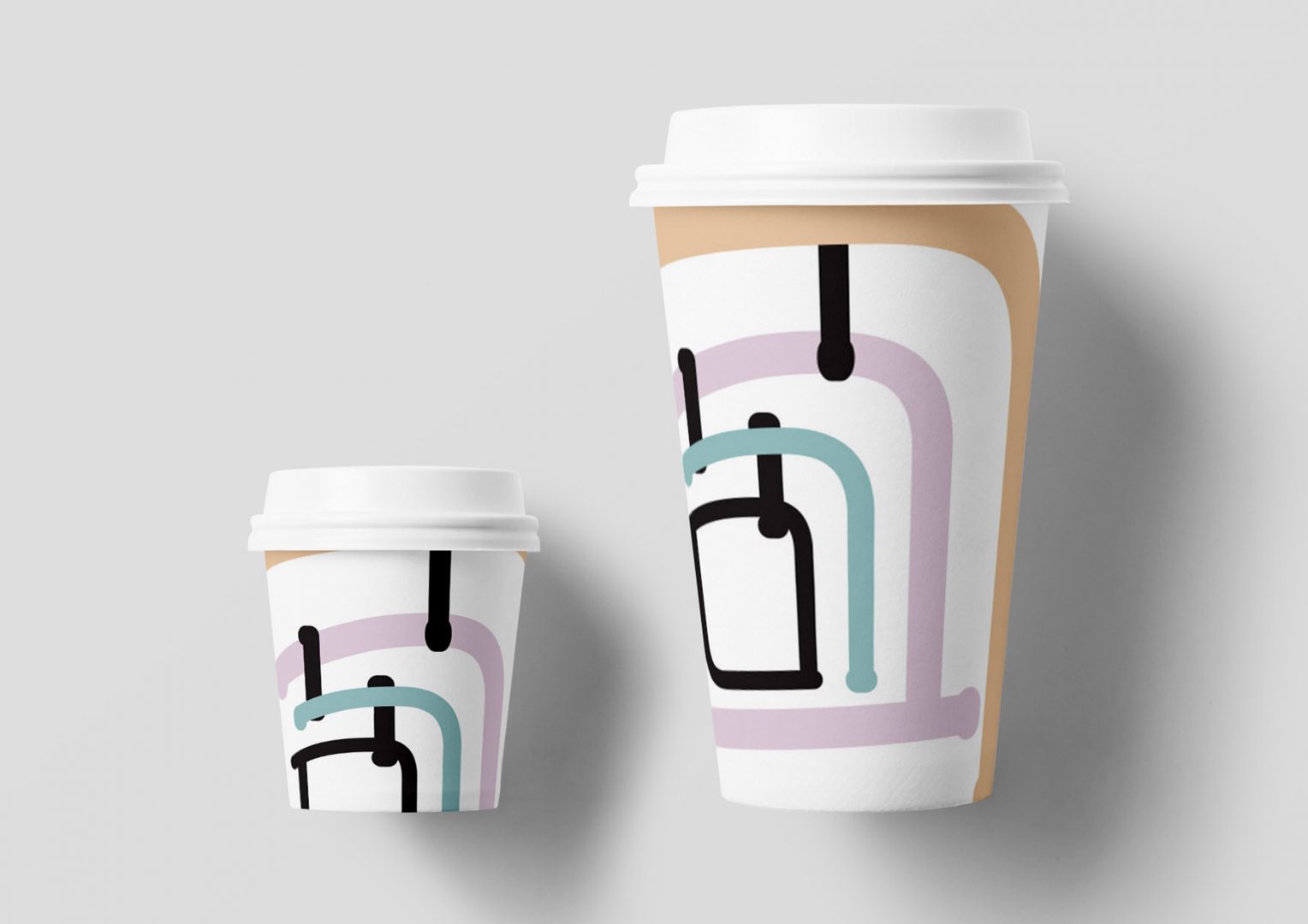
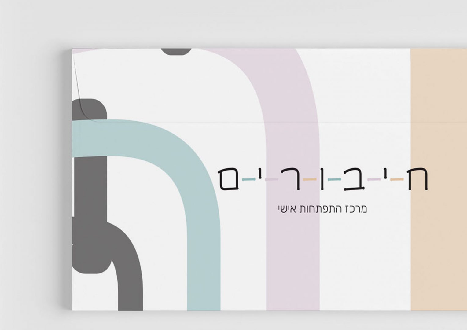
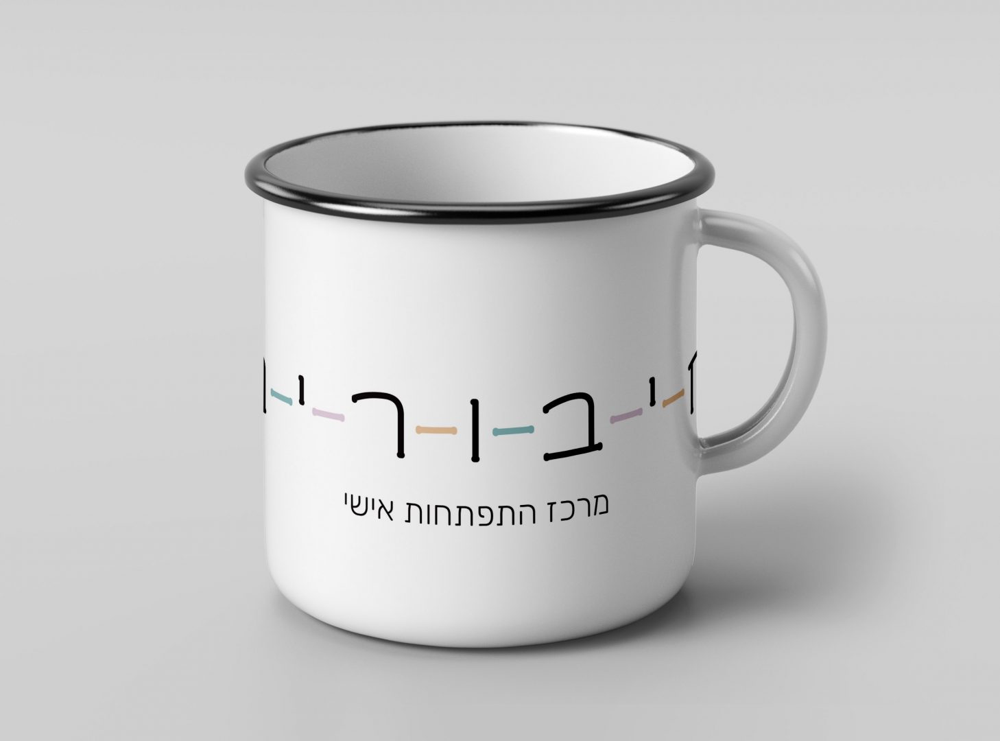
The client i had in mind was a center for personal development. The name i chose represents the connection between the center and the patients and also the inner connection of the patient and it’s self. The logo is composed of the center’s name. Each letter is in a different size and they are arranged from the biggest to the smallest, as a way to indicate the personal process within, that the patient goes through. Some of the letters are used as connectors as another way to indicate the connection concept. Since the process is personal and the patient can feel exposed, i chose a soft color palette.u00a0 u00a0 u00a0 u00a0